Cure Alzheimer’s Fund “CureAlz Update” Newsletter
Category
Content Strategy, Newsletters, PublicationsAbout This Project
Winking Fish worked with Cure Alzheimer’s Fund (CureAlz) to reimagine the organization’s quarterly print newsletter. Having been established for more than 10 years, CureAlz wanted to elevate the content and design approach to better fit an established organization – becoming more magazine than report. CureAlz charged Winking Fish with creating a design that would encourage a more content-leading approach to information delivery – where content drives the publication, rather that the newsletter’s format. We also aimed to create a more modern-looking newsletter that would engage the reader and drive them to the organization’s website for more information.
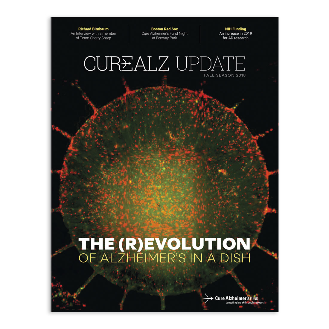
Winking Fish’s strategy for the redesign was to use smart, beautiful design and design choices to elevate CureAlz’s story-telling. This started with the publication’s name and cover. Through the redesign, Winking Fish skillfully worked the organization’s brand directly into the publication’s name and masthead. Previously, the newsletter’s feature story began on the cover page, which also featured a large table of contents graphic. We employed strong imagery to create a compelling, focused cover design that not only elevated the organization, but also created a visual pull to encourage readers to open the magazine.
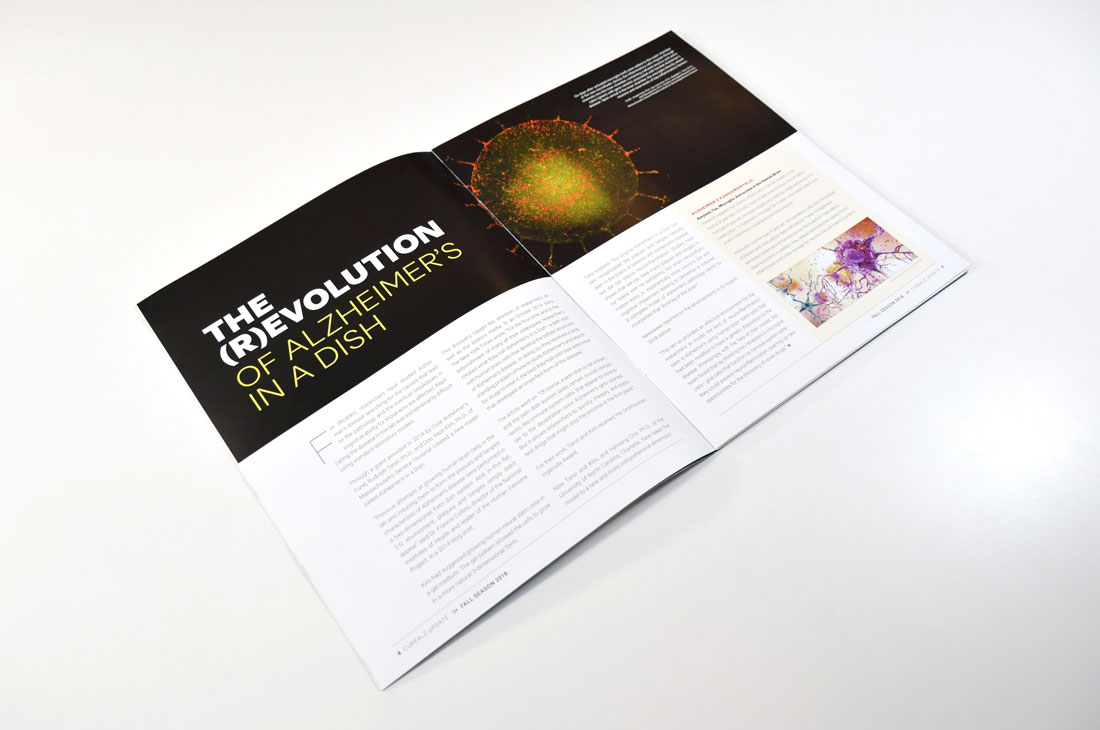
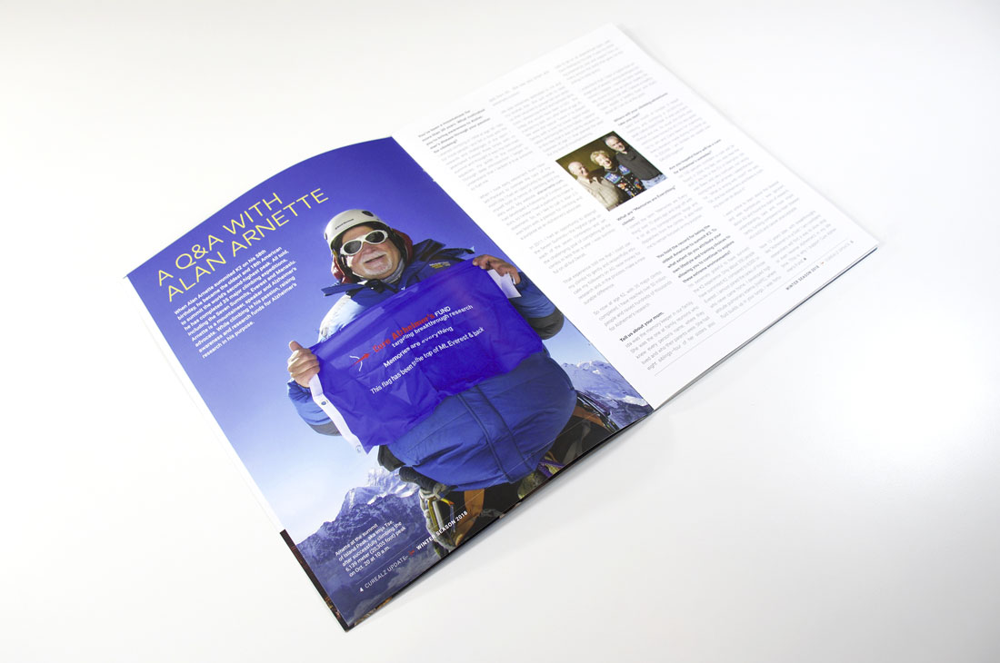
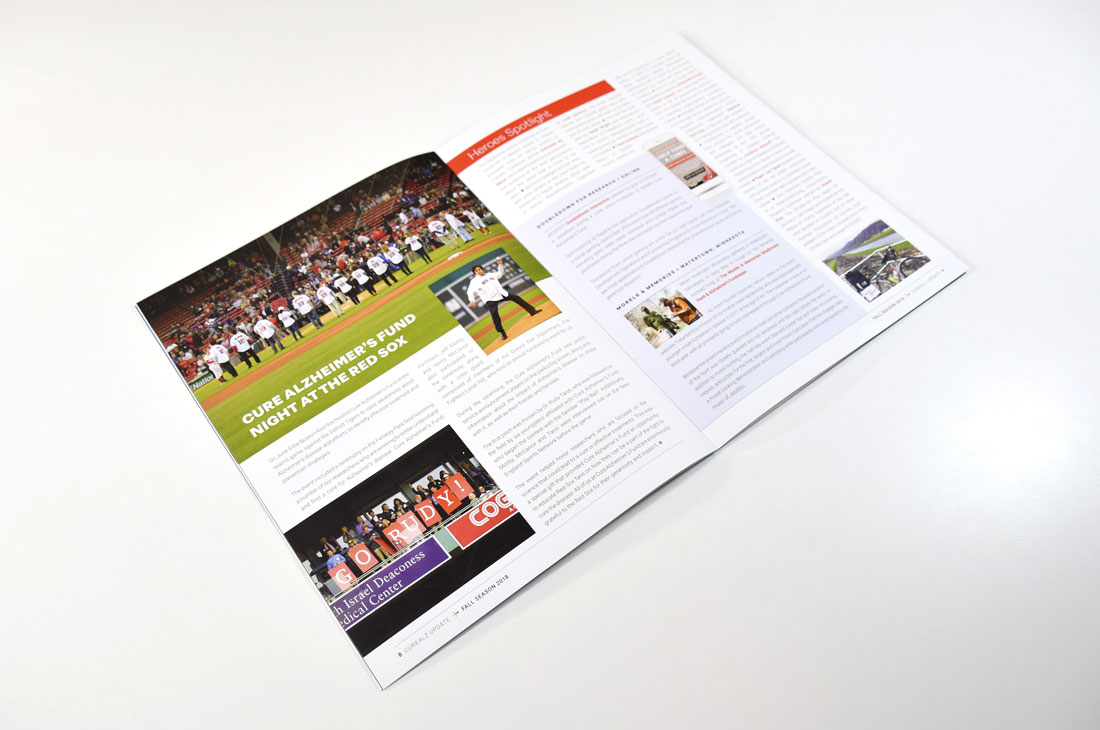
The resulting publication looks and feels more substantial – in design and in content. An emphasis on engaging photography adds visual impact throughout the newsletter and helps bring stories to life. Content and visuals are weighted more appropriately, creating a better balance of information and a natural hierarchy to guide readers through the pub. Winking Fish also developed a clean typography style to guide this redesign, creating a complementary mix of on-brand header, subhead, intro, callout and inset types to ensure a logical and visually-interesting experience for the reader.